New Kit

  • The Fighting Cock is a forum for fans of Tottenham Hotspur Football Club. Here you can discuss Spurs latest matches, our squad, tactics and any transfer news surrounding the club. Registration gives you access to all our forums (including 'Off Topic' discussion) and removes most of the adverts (you can remove them all via an account upgrade). You're here now, you might as well...

    Get involved!

Latest Spurs videos from Sky Sports

Once we see the first new Nike kit of 2017 (so probably an international team) we know what it'll be as ours will be the same except in white and navy. The template bastards.
Still need to announce Nike!
:levyeyes:

Fucking hell, we announced Under Armour in March 2011 ahead of them making our 12/13 kits onwards. That's at least 18 months notice!

Tottenham Hotspur sign kit deal with Under Armour - BBC News

Surely this points towards something more going on with Nike than just kits.
 
These Nike Preston North End kits are a thing of minimalist beauty. Wouldn't mind borrowing from these Lilywhites.
having just come back from berlin, hertha's change kit is very nice.

hertha-berlin-16-17-away-kit.jpg


still dont want Nike though.
 
Not to be a cynic, but I can't see a re-design of the clubs crest being imminent when they've only just decorated everything (including the new offices) with huge versions of the current ones.

Not saying it's impossible, but just doesn't add up?
 
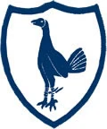
These were the crests from my youth.

167ddb3ce740b4514e736cd843ba74da.jpg


Tottenham_Hotspur_crest.png


Love them both, but they just seem way too fussy compared to our current one.

If there is a redesign I would like to the see the lions and motto incorporated into the simple Cock n Ball.
 
In all seriousness though, I could totally see why they might opt to add a 'shield' around the existing badge - if you compare us with, say, Southampton (which is fair given that they're also Under Armour...)

under-armour-southampton-16-17-kits.jpg


kit1617_730x500.jpg


The comparatively small (at least 'thinner') Spurs logo, twinned with it being the same colour as the kit manufacturer logo, makes it more subtle.
Probably one of the reasons that the red AIA (aside from being red) always pisses us off so much, because the sponsor actually ends up dominating the first and your eyes get drawn to it first.

So if the club wants to 'boost the brand', putting a shield around the cock-and-ball should help draw the eye to it, and help the neutral fan remember who we are. Pair that with a more subtle sponsor, and you're sorted.
And as pointed out before, the best thing about an added shield outline is that you don't need to replace all the branding with it - so Lilywhite House and its giant glowing cock will be just fine.
:allitongue:
 
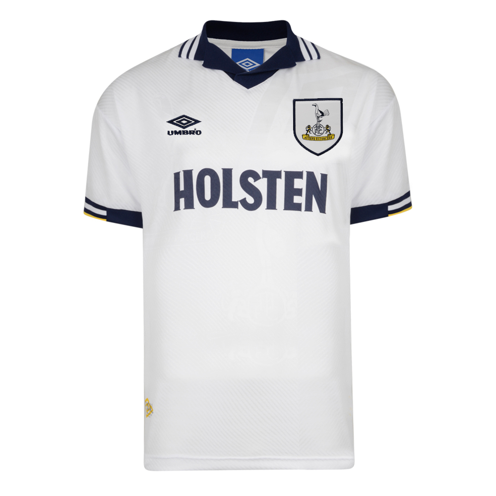
I hated our shield badges.


The replica kits, especially the pony ones, would always have a big lumpy section where the shield was, which gave me a sore nip on that side. It was like wearing a t-shirt with a plate glued to it, too.

The subtle stitched logo is better for so many reasons.
 
I hated our shield badges.
The replica kits, especially the pony ones, would always have a big lumpy section where the shield was, which gave me a sore nip on that side. It was like wearing a t-shirt with a plate glued to it, too.
The subtle stitched logo is better for so many reasons.

They weren't called PONY for nothing!
 
I hated our shield badges.


The replica kits, especially the pony ones, would always have a big lumpy section where the shield was, which gave me a sore nip on that side. It was like wearing a t-shirt with a plate glued to it, too.

The subtle stitched logo is better for so many reasons.

Couldn't get a bigger shield badge than this...
421-189.jpg
 
Back
Top Bottom