
You are using an out of date browser. It may not display this or other websites correctly.
You should upgrade or use an alternative browser.
You should upgrade or use an alternative browser.
-
The Fighting Cock is a forum for fans of Tottenham Hotspur Football Club. Here you can discuss Spurs latest matches, our squad, tactics and any transfer news surrounding the club. Registration gives you access to all our forums (including 'Off Topic' discussion) and removes most of the adverts (you can remove them all via an account upgrade). You're here now, you might as well...
Latest Spurs videos from Sky Sports
Current logo? You have answered your own question.
We have had some form of cockerel on the shirt since at least 1921.
We have had some form of cockerel on the shirt since at least 1921.
This bigger question here is, why on Earth were you watching Grange Hill?!
I'm gonna assume you're over 12.
I'm gonna assume you're over 12.
Can you shed light on this for me, did Kieth Burkinshaw design the 1983 crest. Thats what Ive always understood?Current logo? You have answered your own question.
We have had some form of cockerel on the shirt since at least 1921.
I wish we would go back to the 83-05 crest, that was lovely
The current one has to be the best.............no red in it
Can you shed light on this for me, did Kieth Burkinshaw design the 1983 crest. Thats what Ive always understood?
I have never heard that before! I thought Irving Scholar had a big hand in one of them. Research needed!
There are some missing from this list (ETA a couple of additional images from Historical Football Kits, which appear to contradict other sources):
1921

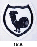
1930
1921-1951

1951-1966

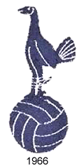
1966
1967-1983

1983-1995
1995-1997

1997-1999
1999-2006
2006 - Present
Last edited:
that logo looks like the one from the Admiral kit.So I was watching an old English kids programme last night called 'Grange Hill'. During the episode one of the actors was holding a Spurs school bag. I noticed our logo but, this episode is from January, 1983,


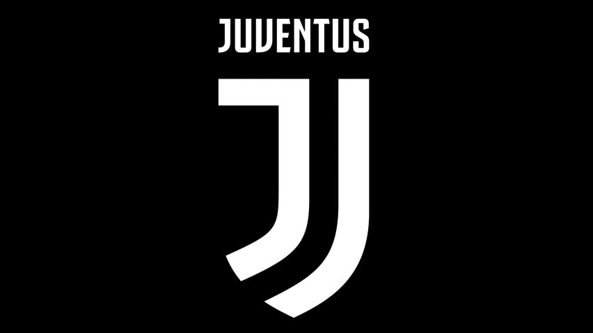
Not sure I agree with this mate. I love Juventus' new identity (from a graphic design perspective) and am surprised it received such a lukewarm reception. But I actually think they followed our lead in creating what you might describe as a lifestyle-type brand rather than a purely sports brand.Our current logo is already 12 years old and I reckon it's time for a change. Something like Juve's logo would be nice:
Our simple monochrome design is perfect, in my opinion. Hard to see how to simplify it too much further without replacing the cockerel.
This. Our current logo is slick and easy to identify without dating it or making it location specific (West Ham's curent logo adding "london" for example).Not sure I agree with this mate. I love Juventus' new identity (from a graphic design perspective) and am surprised it received such a lukewarm reception. But I actually think they followed our lead in creating what you might describe as a lifestyle-type brand rather than a purely sports brand.
Our simple monochrome design is perfect, in my opinion. Hard to see how to simplify it too much further without replacing the cockerel.
Not sure I agree with this mate. I love Juventus' new identity (from a graphic design perspective) and am surprised it received such a lukewarm reception. But I actually think they followed our lead in creating what you might describe as a lifestyle-type brand rather than a purely sports brand.
Our simple monochrome design is perfect, in my opinion. Hard to see how to simplify it too much further without replacing the cockerel.
Juventus new badge and corporate logo may be great from a design perspective but they've completely ditched the entire heritage of the club. No bull, no reference to FIAT. The Drughi hate it.
I totally understand and, if I were a Juve fan, I'd probably be disappointed. But, the point I was trying to make (maybe not very wellJuventus new badge and corporate logo may be great from a design perspective but they've completely ditched the entire heritage of the club. No bull, no reference to FIAT. The Drughi hate it.
") ) was that we have the on-trend minimalism (which I like as a general design style) and we have the heritage elements.
) was that we have the on-trend minimalism (which I like as a general design style) and we have the heritage elements. Unlike so many other clubs' badges, we remain immediately identifiable even if you remove our name.
It's one of the worst changes I've ever seen (in the same league with Leeds' criminal new logo) and I was obviously joking, our current logo is nearly perfect as far as I am concerned.Not sure I agree with this mate. I love Juventus' new identity (from a graphic design perspective) and am surprised it received such a lukewarm reception.
Ah, ok.I was obviously joking, our current logo is nearly perfect as far as I am concerned.

Most rebrands are met with skepticism in part because they're so emotionally invested the old one. The F1 rebrand (which, again, I think is fantastic) is a good example.Remember the current logo getting a battering when it was released for being a Chirpy on top of a beachball etc. Guess we all got used to it now?!
People seem to assume a logo is born iconic. It isn't, it needs time to establish itself.